


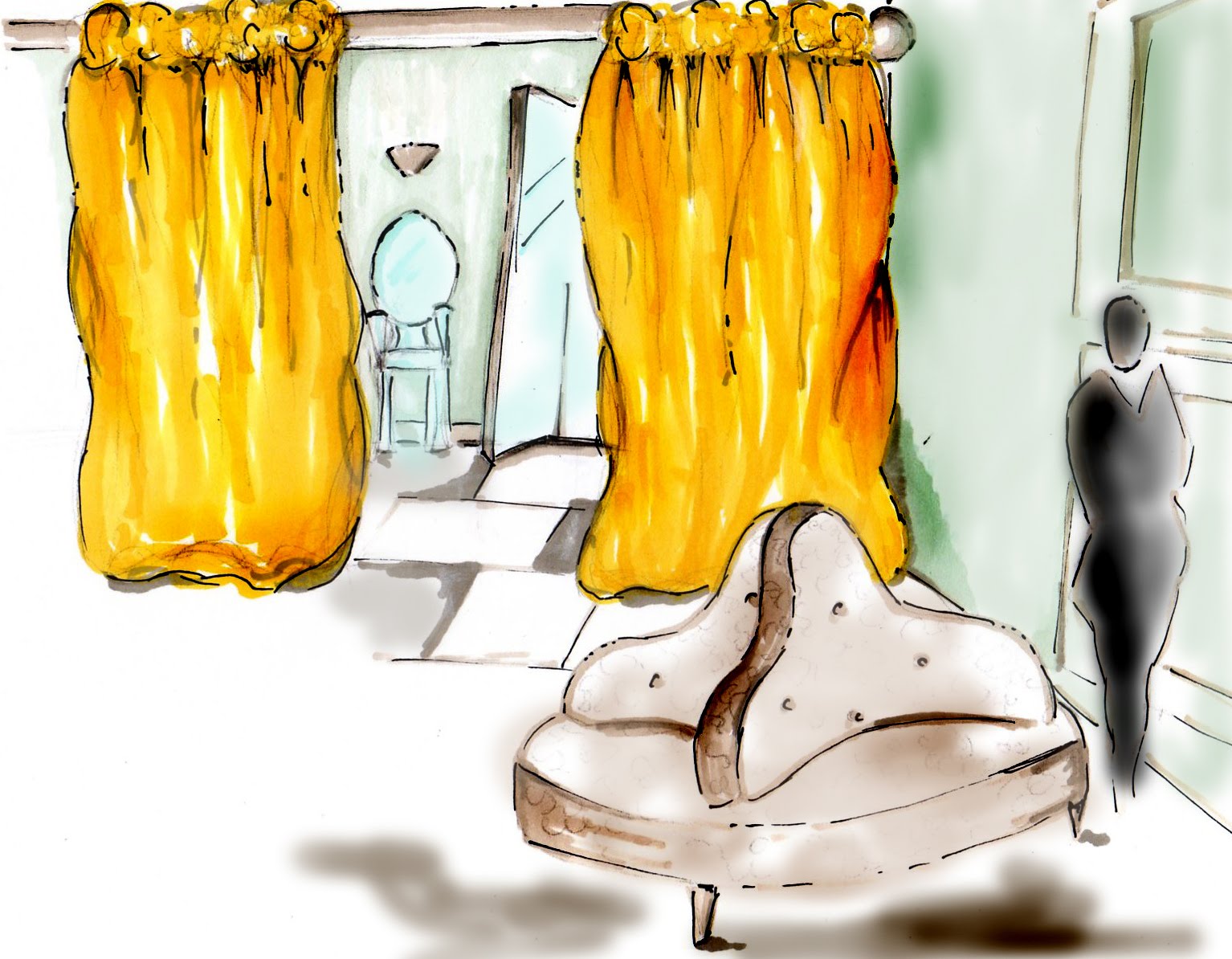


•Faith Johnson is an entrepreneur in her mid-thirties. She started collecting vintage gowns and eveningwear 10 years ago, storing them in her small New York apartment. Recently, Faith has inherited a small storefront in Manhattan. Faith has decided to renovate the store and open a women’s eveningwear boutique featuring her vintage collection as well as other unique eveningwear from new local designers. The goal is to provide a chic, yet vintage retail environment that meets customers'’ eveningwear needs as well as designing eye-catching displays that lead customers to point of purchases. This will be archived through the application of layering interesting and textured materials through the space; in doing so the store will be transformed into an elegant lunar experience. The lunar experience is created with a cool color pallet, in lieu of the moon, and dashes of canary yellow and the use of light captures the essence of the stars. The chic aspect of the design comes in with the black and white flooring, the coffered ceiling tiles, and many of the modern and vintage display pieces. Some of the finishes used in the retail space are as follows: 1) Canary yellow, satin-faced taffeta dressing room curtains. This finish gives the dressing rooms a warm and luxurious feel. 2) Curved LUME showroom dividers. These are LED embedded textiles that hang from the ceiling to divide the space and create focal displays but still allow translucency so you can see throughout the showroom. 3) Backlit alabaster finish for the front of the cash wrap gives off a warm glow like the stars in space and also creates a focal point. 4) Distressed metal sheets applied to archways and a frame offer a texture throughout the space and represent the craters found on the moon. 5) The interior walls are the existing, worn brick of the original building. I have chosen to leave some of that brick exposed but also incorporate a floating gypsum board that is backlit. Layering the new, freshly painted gypsum board on the old bricks adds architectural interest while preserving the historical appeal of the building. This also gives the retail space a clean surface without completely reframing and dry walling the entire space. 6) Polished black and white diamond checkered flooring will add sophistication and reflection. 7) The fixtures and furniture used in the space are clear acrylic, vintage mirrored furniture, and ornate nesting tables. The combination of materials used on the display pieces offer interest as well as function. Clear acrylic allows light to penetrate, eliminating distracting shadows on products. Combining vintage and modern pieces adds interest and offers consistency with the owner’s merchandise which also combines vintage and modern eveningwear. 8) Being a high-end boutique, no slat walls or other generic panels or hardware is used to merchandise products. Instead, custom shelving was created out of both metal and acrylic for the displays. The custom wall display units are flexible and have spotlighting incorporated into them. These wall units are constructed from acrylic while the frame on the face of the box is distressed metal. These boxed allow dresses to be organized by color and suggested accessories can easily be changed out from the surrounding shelves. The vertical segments create order and a clear merchandise story. The Floor Plan The entry to the store has an angled façade. This draws customers into the space and allows for additional window display space. The floor plan is a “pathway plan”. It pulls shoppers smoothly from the front to the rear, weaving them around displays. The pathway is set up to maximize the large windows and high ceilings in the space. As you enter the front door, you have visibility to the back of the store because LUME, an LED textile, is suspended from the ceiling and is used for transparent partitions throughout the space. Set under or adjacent to each LUME partition is a display grouping, organized by color and collection. Along the wall in the main showroom and the walls in the smaller rooms, are acrylic and metal constructed box-like displays for evening dresses. These boxes are arranged according to color and accessories that coordinate with the dresses offered in that space are on the adjacent shelving. In the front little room is an island display chest where lingerie is displayed and stored. Throughout the showroom are spiral racks also used for lingerie display. There are focal displays throughout the space using mannequins as well as simply hanging one dress in a box along the wall. Showcasing these dresses is achieved by placing it in a space that doesn’t make the dress compete with others and through the lighting used to highlight the dress. Graphic photography of women wearing the clothes is visible near or behind the dress. The cash wrap is made a focal point in the space by using the backlit alabaster on the facade of the cash wrap and the two light pendants hanging on either side. Behind the desk is an art sculpture of crystal gems that gives the space a unique, high-end sensation. The dressing rooms are well indicated by another focal wall, with the “LS” logo printed on the accent wall leading into the dressing rooms. The luxurious curtains dividing the individual dressing rooms add to the elite experience. In addition, the warm, high-end lighting fixtures give the dressing rooms the “mood lighting” that represents evening lighting. Evening is when the dresses will be most likely worn. In the dressing room area is a round, antique seating couch and acrylic chairs. A large mirror and step block are located here as well for use when alterations are being made. The ceiling is lower in the individual fitting rooms since human factor allows customers to be more comfortable changing when they feel cozier. The back of the house is a small space designed to be used for storage as well as space to work on alterations and book keeping. The Ceiling is Gypsum board at 9’ and 12’ accent coffered ceiling tiles. Having the 12’ coffered ceiling in the center of the spaces gives the store a grand sense. Having the 9’ ceiling height in the rest of the space relates to human factor and people are more comfortable at that scale of ceiling. Flexible Lighting is used in the space 1)LUME is LED embedded fabric. It is bright enough to be used for ambient lighting but in the application in this space is used for accent and sparkle lighting. The textile is ultra thin and flexible. In this space it is used in a curve as a translucent partition in the showroom. 2) Pendant lighting is used on either side of the cash wrap to add presence to the area and it is used in the dressing rooms to create mood lighting. 3) The floating wall used in the showroom is back lit with fiber optic lighting to create a halo effect from behind the wall. This technique gives the walls the illusion that they are floating.4) Track lighting is used throughout the showroom to allow for adjustable spotlighting on the displays as they change. 6) Recessed cans are used throughout the space for general ambient lighting. Branding is important to the success of a retail store. Lost Society eveningwear boutique is marketing to a population of women in their mid-twenties to late-forties. The goal is to market the boutique as a one stop location for all eveningwear needs from the dress to the shoes to what’s going on underneath it all. Offering alterations at the store location makes buying a dress, whether vintage or new, more convenient for consumers with busy lives. Fashion spreads will be used as advertisement throughout the store, on flyers and on local ads alike. The logo and signage are the two images that will be used for branding and marketing the boutique. The images will be used in places such as: the sign above the door, the watermark on the window of the front door, the focal wall as you enter the dressing rooms, the dress bags, the ads, the flyers, the calling cards, ect.


